How to make bike product card with HTML and CSS Tutorial
Are you a biking enthusiast looking to showcase your favorite bike products on your website? Look no further! In this tutorial, we’ll guide you through creating a visually appealing bike product card using HTML and CSS. Whether you’re a beginner or an experienced developer, you’ll find this tutorial easy to follow and implement.
Through this tutorial, we aim to empower you – whether you’re a seasoned developer or a newcomer to the world of web design – to bring your biking universe to life on the web. Together, we’ll learn how to sculpt elegant product cards that showcase your favorite bike gear in all its glory, drawing inspiration from the beauty of the natural world and the ingenuity of human craftsmanship.
So saddle up, dear friends, and prepare to embark on a journey where creativity knows no bounds, and the possibilities are as endless as the open road. Let us unlock the pedals of creativity together, as we pedal our way through the enchanting landscape of web design and discover the joy of bringing our biking dreams to life online.
To use this HTML code, follow these steps:
1. Save the HTML code in a file with a `.html` extension, such as `product_card.html`.
2. Save the CSS code in a file named `style.css` in the same directory as the HTML file.
3. Make sure you have an internet connection, as the code includes links to external resources like Google Fonts and Font Awesome.
4. Open the HTML file using a web browser like Google Chrome, Mozilla Firefox, or Microsoft Edge.
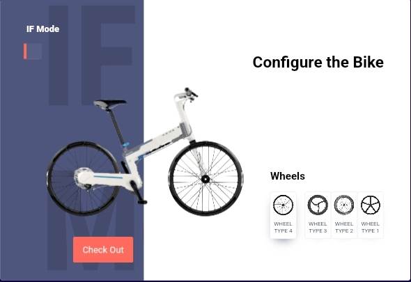
Once you open the HTML file in your web browser, you should see a product card interface with configurable options for a bike. You can interact with the checkboxes and radio buttons to customize the bike’s wheels, and the interface will visually update accordingly.

HTML Code
<!DOCTYPE html>
<html lang="en">
<head>
  <meta charset="UTF-8">
  <title>Product Card | Sourabh.study</title>
  <link href="https://fonts.googleapis.com/css2?family=Roboto:wght@400;500;900&display=swap" rel="stylesheet">
  <link rel="stylesheet" href="https://cdnjs.cloudflare.com/ajax/libs/normalize/5.0.0/normalize.min.css">
  <link rel="stylesheet" href="https://cdnjs.cloudflare.com/ajax/libs/font-awesome/5.15.1/css/all.min.css">
  <link rel="stylesheet" href="./style.css">
</head>
<body>

<div id='wrap'>
  <input class='initial' type='checkbox'>
  <input class='wheel1' name='wheel' type='radio'>
  <input class='wheel2' name='wheel' type='radio'>
  <input class='wheel3' name='wheel' type='radio'>
  <input class='wheel4' name='wheel' type='radio'>
  <input class='buy' type='checkbox'>

  <h1>Configure the Bike</h1>
  <h2>Added to Cart</h2>
  <h3>Wheels</h3>

  <div class='wheeltoggle'></div>
  <div class='wheeltoggle'></div>
  <div class='wheeltoggle'></div>
  <div class='wheeltoggle'></div>
  <div class='buy'></div>

  <div class='toggle expand'>
    <i class='fas fa-bicycle'></i>
  </div>

  <div class='toggle'>
    <i class='fas fa-bicycle'></i>
  </div>

  <div class='background'></div>

  <div class='frame'>
    <div class='rear'></div>
    <div class='stem'></div>
    <div class='shaft'></div>
    <div class='seat'></div>
    <div class='wheel one front'>
      <div class='inner'></div>
    </div>
    <div class='wheel one back'>
      <div class='inner'></div>
    </div>
  </div>
</div>

</body>
</html>
CSS code
body {
  display: grid;
  place-items: center;
  height: 100vh;
  font-family: "Roboto";
  background: #180148;
}
body #wrap {
  width: 800px;
  height: 550px;
  background: #efefef;
  box-shadow: 0 20px 40px -15px rgba(0, 0, 0, 0.25);
  position: relative;
  border-radius: 5px;
  overflow: hidden;
  display: grid;
  grid-template-columns: repeat(15, 1fr);
  grid-template-rows: repeat(15, 1fr);
  grid-column-gap: 0px;
  grid-row-gap: 0px;
}
body #wrap h1,
body #wrap h2 {
  grid-area: 4/10/5/15;
  color: #000;
  position: relative;
  z-index: 9;
  font-size: 28px;
  transition: 0.4s cubic-bezier(0.75, 0.885, 0.32, 1);
  text-align: right;
  opacity: 0.25;
}
body #wrap h2 {
  grid-area: 4/2/5/7;
  text-align: left;
  transform: translateY(100px);
  opacity: 0;
}
body #wrap h3 {
  position: relative;
  z-index: 9;
  grid-area: 10/11/11/12;
  opacity: 0.25;
  transition: 0.4s cubic-bezier(0.75, 0.885, 0.32, 1);
}
body #wrap .toggle {
  width: 30px;
  height: 30px;
  box-shadow: -5px 0 0 rgba(255, 255, 255, 0.15);
  z-index: 9;
  background: rgba(255, 255, 255, 0.05);
  position: relative;
  grid-area: 4/2/5/3;
  transition: 0.2s ease-in-out;
}
body #wrap .toggle.expand:before {
  content: "IF Mode";
  position: absolute;
  color: #fff;
  top: -40px;
  width: 100px;
  font-weight: 900;
}
body #wrap .toggle i {
  color: #fff;
  position: absolute;
  top: 50%;
  left: 50%;
  transform: translate(-50%, -50%);
}
body #wrap .toggle:not(.expand) {
  margin-top: 40px;
  box-shadow: -5px 0 0 #ff6a5e;
}
body #wrap .toggle:not(.expand) i {
  transform: translate(-50%, -50%) rotate(-90deg);
}
body #wrap input {
  cursor: pointer;
  opacity: 0;
}
body #wrap .buy {
  grid-area: 14/3/15/5;
  background: #ff6a5e;
  position: relative;
  height: 50px;
  left: 40px;
  border-radius: 3px;
  z-index: 9;
  transition: 0.2s ease-in-out;
  transform: translateY(200px);
}
body #wrap .buy:not(input) {
  pointer-events: none;
  -webkit-animation: fadein 0.2s ease-in-out 1 forwards;
          animation: fadein 0.2s ease-in-out 1 forwards;
}
@-webkit-keyframes fadein {
  from {
    opacity: 0;
  }
  to {
    opacity: 1;
  }
}
@keyframes fadein {
  from {
    opacity: 0;
  }
  to {
    opacity: 1;
  }
}
body #wrap .buy:not(input):after {
  content: "Buy Now";
  position: absolute;
  width: 100%;
  height: 100%;
  box-shadow: 0 0 0 1px #ff6a5e;
  border-radius: inherit;
  right: calc(100% + 10px);
  top: 0;
  display: flex;
  justify-content: center;
  align-items: center;
  color: #ff6a5e;
  cursor: pointer;
  transition: 0.6s ease-in-out;
  transform: translateY(200px);
}
body #wrap .buy:before {
  content: "Check Out";
  width: 100%;
  height: 100%;
  display: flex;
  justify-content: center;
  align-items: center;
  color: #fff;
  -webkit-animation: buynow 1s ease-in-out 1 forwards;
          animation: buynow 1s ease-in-out 1 forwards;
}
@-webkit-keyframes buynow {
  0% {
    opacity: 0;
  }
  100% {
    opacity: 1;
    content: "Check Out";
  }
}
@keyframes buynow {
  0% {
    opacity: 0;
  }
  100% {
    opacity: 1;
    content: "Check Out";
  }
}
body #wrap input.initial {
  position: relative;
  grid-area: 4/2/5/3;
  z-index: 999;
  width: 30px;
  height: 70px;
  opacity: 0;
}
body #wrap input.initial:first-of-type:hover ~ .toggle.expand {
  background: #ff6a5e;
}
body #wrap input.initial:checked {
  pointer-events: none;
}
body #wrap input.initial:checked ~ .toggle:not(.expand) {
  transform: translateX(-100px);
}
body #wrap input.initial:checked ~ input[type=radio] {
  pointer-events: all;
}
body #wrap input.initial:checked ~ .wheeltoggle, body #wrap input.initial:checked ~ h3, body #wrap input.initial:checked ~ h1 {
  filter: saturate(1);
  opacity: 1;
}
body #wrap input.initial:checked ~ .buy {
  transform: translateY(0);
  min-width: 110px;
  transition-delay: 1s;
}
body #wrap input.initial:checked ~ .buy:after {
  transform: translateY(200px);
}
body #wrap input.initial:checked ~ .buy:checked {
  transform: translateY(-250px);
}
body #wrap input.initial:checked ~ .buy:checked ~ .toggle {
  opacity: 0;
}
body #wrap input.initial:checked ~ .buy:checked ~ .frame .wheel .inner {
  -webkit-animation: wheelroll6 1.25s ease-in-out 1 forwards;
          animation: wheelroll6 1.25s ease-in-out 1 forwards;
}
body #wrap input.initial:checked ~ .buy:checked ~ h2 {
  transform: translateY(0px);
  transition-delay: 0.4s;
  opacity: 1;
}
body #wrap input.initial:checked ~ .buy:checked ~ .wheeltoggle, body #wrap input.initial:checked ~ .buy:checked ~ h1, body #wrap input.initial:checked ~ .buy:checked ~ h3 {
  transform: translateY(100px);
  opacity: 0;
}
body #wrap input.initial:checked ~ .buy:checked ~ .wheeltoggle:nth-of-type(1) {
  transition-delay: 0.05s;
}
body #wrap input.initial:checked ~ .buy:checked ~ .wheeltoggle:nth-of-type(2) {
  transition-delay: 0.1s;
}
body #wrap input.initial:checked ~ .buy:checked ~ .wheeltoggle:nth-of-type(3) {
  transition-delay: 0.15s;
}
body #wrap input.initial:checked ~ .buy:checked ~ .wheeltoggle:nth-of-type(4) {
  transition-delay: 0.2s;
}
body #wrap input.initial:checked ~ .buy:checked ~ h3 {
  transition-delay: 0.1s;
}
body #wrap input.initial:checked ~ .buy:checked ~ .buy {
  -webkit-animation: bounceback 1s ease-in-out 1 forwards;
          animation: bounceback 1s ease-in-out 1 forwards;
}
body #wrap input.initial:checked ~ .buy:checked ~ .buy:after {
  transition-delay: 0.3s;
  transform: translateY(0);
  opacity: 1;
}
body #wrap input.initial:checked ~ .buy:checked ~ .buy:before {
  -webkit-animation: buynow2 1s ease-in-out 1 forwards;
          animation: buynow2 1s ease-in-out 1 forwards;
}
@-webkit-keyframes buynow2 {
  100% {
    content: "Back";
  }
}
@keyframes buynow2 {
  100% {
    content: "Back";
  }
}
@-webkit-keyframes bounceback {
  0% {
    transform: translateY(0px);
  }
  50% {
    transform: translateY(200px);
  }
  50.5% {
    transform: translateY(200px);
    opacity: 0;
  }
  51% {
    transform: translateY(-200px);
    opacity: 0;
  }
  100% {
    transform: translateY(-250px);
  }
}
@keyframes bounceback {
  0% {
    transform: translateY(0px);
  }
  50% {
    transform: translateY(200px);
  }
  50.5% {
    transform: translateY(200px);
    opacity: 0;
  }
  51% {
    transform: translateY(-200px);
    opacity: 0;
  }
  100% {
    transform: translateY(-250px);
  }
}
body #wrap input.initial:checked ~ .buy:checked ~ .frame:not(.two):not(i):not(.buy) {
  transform: scale(0.7) translateX(350px) translateY(50px);
  transition: 0.75s cubic-bezier(0.75, 0.885, 0.32, 1);
  transition-delay: 0.25s;
}
body #wrap input.initial:checked ~ .buy:checked ~ .background:before {
  transition: transform 0.4s cubic-bezier(0.75, 0.885, 0.32, 1), left 0.4s cubic-bezier(0.75, 0.885, 0.32, 1) !important;
  transition-delay: 0.4s, 0.8s !important;
  transform-origin: right;
  transform: scaleX(2) !important;
  left: -5%;
}
body #wrap input.initial:checked ~ .buy:checked ~ .background:after {
  transform: scaleY(1.25) translateX(-40px) !important;
  transition-delay: 0.3s;
}
body #wrap input.initial:checked ~ .buy:not(div) {
  pointer-events: all;
  z-index: 999;
}
body #wrap input.initial:checked ~ .buy:not(div):hover ~ .buy {
  transition-delay: 0s;
  background: #ff3b2b;
}
body #wrap .wheeltoggle {
  box-shadow: 0 0 0 1px #efefef, 0 10px 20px -20px #4e567d;
  border-radius: 3px;
  transition: 0.3s ease-in-out;
  pointer-events: none;
  filter: saturate(0);
  opacity: 0.5;
  background: #fff;
  z-index: 9;
}
body #wrap .wheeltoggle:before {
  content: "";
  position: absolute;
  width: 100%;
  height: 50px;
  top: 0;
  transition: 0.4s ease-in-out;
}
body #wrap .wheeltoggle:nth-of-type(1):after {
  content: "Wheel Type 1";
  position: absolute;
  width: 100%;
  top: 55px;
  font-size: 10px;
  text-align: center;
  line-height: 1.25;
  color: #4e567d;
  text-transform: uppercase;
}
body #wrap .wheeltoggle:nth-of-type(1):before {
  background: url(https://assets.codepen.io/383755/wheel1.png) 50% 50%/80% auto no-repeat;
}
body #wrap .wheeltoggle:nth-of-type(2):after {
  content: "Wheel Type 2";
  position: absolute;
  width: 100%;
  top: 55px;
  font-size: 10px;
  text-align: center;
  line-height: 1.25;
  color: #4e567d;
  text-transform: uppercase;
}
body #wrap .wheeltoggle:nth-of-type(2):before {
  background: url(https://assets.codepen.io/383755/wheel2.png) 50% 50%/80% auto no-repeat;
}
body #wrap .wheeltoggle:nth-of-type(3):after {
  content: "Wheel Type 3";
  position: absolute;
  width: 100%;
  top: 55px;
  font-size: 10px;
  text-align: center;
  line-height: 1.25;
  color: #4e567d;
  text-transform: uppercase;
}
body #wrap .wheeltoggle:nth-of-type(3):before {
  background: url(https://assets.codepen.io/383755/wheel3.png) 50% 50%/80% auto no-repeat;
}
body #wrap .wheeltoggle:nth-of-type(4):after {
  content: "Wheel Type 4";
  position: absolute;
  width: 100%;
  top: 55px;
  font-size: 10px;
  text-align: center;
  line-height: 1.25;
  color: #4e567d;
  text-transform: uppercase;
}
body #wrap .wheeltoggle:nth-of-type(4):before {
  background: url(https://assets.codepen.io/383755/wheel4.png) 50% 50%/80% auto no-repeat;
}
body #wrap input[type=radio],
body #wrap .wheeltoggle {
  position: absolute;
  z-index: 999;
  width: 50px;
  height: 90px;
  z-index: 999;
  pointer-events: none;
}
body #wrap input[type=radio].wheel1, body #wrap input[type=radio]:not(input):nth-of-type(1),
body #wrap .wheeltoggle.wheel1,
body #wrap .wheeltoggle:not(input):nth-of-type(1) {
  grid-area: 11/14/12/15;
}
body #wrap input[type=radio].wheel2, body #wrap input[type=radio]:not(input):nth-of-type(2),
body #wrap .wheeltoggle.wheel2,
body #wrap .wheeltoggle:not(input):nth-of-type(2) {
  grid-area: 11/13/12/14;
}
body #wrap input[type=radio].wheel3, body #wrap input[type=radio]:not(input):nth-of-type(3),
body #wrap .wheeltoggle.wheel3,
body #wrap .wheeltoggle:not(input):nth-of-type(3) {
  grid-area: 11/12/12/13;
}
body #wrap input[type=radio].wheel4, body #wrap input[type=radio]:not(input):nth-of-type(4),
body #wrap .wheeltoggle.wheel4,
body #wrap .wheeltoggle:not(input):nth-of-type(4) {
  grid-area: 11/11/12/12;
}
body #wrap input[type=radio].wheel1:checked ~ .wheeltoggle:nth-of-type(1),
body #wrap .wheeltoggle.wheel1:checked ~ .wheeltoggle:nth-of-type(1) {
  box-shadow: 0 0 0 1px #ff6a5e, 0 10px 20px -30px #4e567d;
}
body #wrap input[type=radio].wheel1:hover ~ .wheeltoggle:nth-of-type(1),
body #wrap .wheeltoggle.wheel1:hover ~ .wheeltoggle:nth-of-type(1) {
  box-shadow: 0 0 0 1px #efefef, 0 10px 20px -10px #4e567d;
  transform: scale(1.05);
}
body #wrap input[type=radio].wheel1:hover ~ .wheeltoggle:nth-of-type(1):before,
body #wrap .wheeltoggle.wheel1:hover ~ .wheeltoggle:nth-of-type(1):before {
  transform: rotate(180deg);
}
body #wrap input[type=radio].wheel1:checked ~ .frame > div.wheel,
body #wrap .wheeltoggle.wheel1:checked ~ .frame > div.wheel {
  -webkit-animation: wheelout1 0.75s ease-in-out 1 forwards 0.25s;
          animation: wheelout1 0.75s ease-in-out 1 forwards 0.25s;
}
body #wrap input[type=radio].wheel1:checked ~ .frame > div.wheel .inner:before,
body #wrap .wheeltoggle.wheel1:checked ~ .frame > div.wheel .inner:before {
  background-image: url(https://assets.codepen.io/383755/wheel1.png);
  -webkit-animation: wheelroll1 1s ease-in-out 1 forwards 0s;
          animation: wheelroll1 1s ease-in-out 1 forwards 0s;
}
@-webkit-keyframes wheelroll1 {
  from {
    transform: rotate(0deg);
  }
  to {
    transform: rotate(720deg);
  }
}
@keyframes wheelroll1 {
  from {
    transform: rotate(0deg);
  }
  to {
    transform: rotate(720deg);
  }
}
@-webkit-keyframes wheelroll6 {
  from {
    transform: rotate(0deg);
  }
  to {
    transform: rotate(360deg);
  }
}
@keyframes wheelroll6 {
  from {
    transform: rotate(0deg);
  }
  to {
    transform: rotate(360deg);
  }
}
body #wrap input[type=radio].wheel1:checked ~ .frame > div.wheel.back,
body #wrap .wheeltoggle.wheel1:checked ~ .frame > div.wheel.back {
  -webkit-animation: wheelback1 0.75s cubic-bezier(0.75, 0.885, 0.32, 1) 1 forwards 0.25s;
          animation: wheelback1 0.75s cubic-bezier(0.75, 0.885, 0.32, 1) 1 forwards 0.25s;
}
@-webkit-keyframes wheelback1 {
  0% {
    transform: translate(0px);
  }
  50% {
    transform: translateX(-700px);
  }
  100% {
    transform: translate(0px);
  }
}
@keyframes wheelback1 {
  0% {
    transform: translate(0px);
  }
  50% {
    transform: translateX(-700px);
  }
  100% {
    transform: translate(0px);
  }
}
@-webkit-keyframes wheelout1 {
  0% {
    transform: translate(0px);
  }
  50% {
    transform: translateX(700px);
  }
  100% {
    transform: translate(0px);
  }
}
@keyframes wheelout1 {
  0% {
    transform: translate(0px);
  }
  50% {
    transform: translateX(700px);
  }
  100% {
    transform: translate(0px);
  }
}
body #wrap input[type=radio].wheel1:checked ~ .frame > div:not(.wheel),
body #wrap .wheeltoggle.wheel1:checked ~ .frame > div:not(.wheel) {
  -webkit-animation: jump1 0.75s cubic-bezier(0.75, 0.885, 0.32, 1) 1 forwards 0.25s;
          animation: jump1 0.75s cubic-bezier(0.75, 0.885, 0.32, 1) 1 forwards 0.25s;
}
@-webkit-keyframes jump1 {
  0% {
    transform: translateY(0);
  }
  50% {
    transform: translateY(-75px) rotate(-2.5deg);
  }
  100% {
    transform: translateY(0);
  }
}
@keyframes jump1 {
  0% {
    transform: translateY(0);
  }
  50% {
    transform: translateY(-75px) rotate(-2.5deg);
  }
  100% {
    transform: translateY(0);
  }
}
body #wrap input[type=radio].wheel2:checked ~ .wheeltoggle:nth-of-type(2),
body #wrap .wheeltoggle.wheel2:checked ~ .wheeltoggle:nth-of-type(2) {
  box-shadow: 0 0 0 1px #ff6a5e, 0 10px 20px -30px #4e567d;
}
body #wrap input[type=radio].wheel2:hover ~ .wheeltoggle:nth-of-type(2),
body #wrap .wheeltoggle.wheel2:hover ~ .wheeltoggle:nth-of-type(2) {
  box-shadow: 0 0 0 1px #efefef, 0 10px 20px -10px #4e567d;
  transform: scale(1.05);
}
body #wrap input[type=radio].wheel2:hover ~ .wheeltoggle:nth-of-type(2):before,
body #wrap .wheeltoggle.wheel2:hover ~ .wheeltoggle:nth-of-type(2):before {
  transform: rotate(180deg);
}
body #wrap input[type=radio].wheel2:checked ~ .frame > div.wheel,
body #wrap .wheeltoggle.wheel2:checked ~ .frame > div.wheel {
  -webkit-animation: wheelout2 0.75s ease-in-out 1 forwards 0.25s;
          animation: wheelout2 0.75s ease-in-out 1 forwards 0.25s;
}
body #wrap input[type=radio].wheel2:checked ~ .frame > div.wheel .inner:before,
body #wrap .wheeltoggle.wheel2:checked ~ .frame > div.wheel .inner:before {
  background-image: url(https://assets.codepen.io/383755/wheel2.png);
  -webkit-animation: wheelroll2 1s ease-in-out 1 forwards 0s;
          animation: wheelroll2 1s ease-in-out 1 forwards 0s;
}
@-webkit-keyframes wheelroll2 {
  from {
    transform: rotate(0deg);
  }
  to {
    transform: rotate(720deg);
  }
}
@keyframes wheelroll2 {
  from {
    transform: rotate(0deg);
  }
  to {
    transform: rotate(720deg);
  }
}
@keyframes wheelroll6 {
  from {
    transform: rotate(0deg);
  }
  to {
    transform: rotate(360deg);
  }
}
body #wrap input[type=radio].wheel2:checked ~ .frame > div.wheel.back,
body #wrap .wheeltoggle.wheel2:checked ~ .frame > div.wheel.back {
  -webkit-animation: wheelback2 0.75s cubic-bezier(0.75, 0.885, 0.32, 1) 1 forwards 0.25s;
          animation: wheelback2 0.75s cubic-bezier(0.75, 0.885, 0.32, 1) 1 forwards 0.25s;
}
@-webkit-keyframes wheelback2 {
  0% {
    transform: translate(0px);
  }
  50% {
    transform: translateX(-700px);
  }
  100% {
    transform: translate(0px);
  }
}
@keyframes wheelback2 {
  0% {
    transform: translate(0px);
  }
  50% {
    transform: translateX(-700px);
  }
  100% {
    transform: translate(0px);
  }
}
@-webkit-keyframes wheelout2 {
  0% {
    transform: translate(0px);
  }
  50% {
    transform: translateX(700px);
  }
  100% {
    transform: translate(0px);
  }
}
@keyframes wheelout2 {
  0% {
    transform: translate(0px);
  }
  50% {
    transform: translateX(700px);
  }
  100% {
    transform: translate(0px);
  }
}
body #wrap input[type=radio].wheel2:checked ~ .frame > div:not(.wheel),
body #wrap .wheeltoggle.wheel2:checked ~ .frame > div:not(.wheel) {
  -webkit-animation: jump2 0.75s cubic-bezier(0.75, 0.885, 0.32, 1) 1 forwards 0.25s;
          animation: jump2 0.75s cubic-bezier(0.75, 0.885, 0.32, 1) 1 forwards 0.25s;
}
@-webkit-keyframes jump2 {
  0% {
    transform: translateY(0);
  }
  50% {
    transform: translateY(-75px) rotate(-2.5deg);
  }
  100% {
    transform: translateY(0);
  }
}
@keyframes jump2 {
  0% {
    transform: translateY(0);
  }
  50% {
    transform: translateY(-75px) rotate(-2.5deg);
  }
  100% {
    transform: translateY(0);
  }
}
body #wrap input[type=radio].wheel3:checked ~ .wheeltoggle:nth-of-type(3),
body #wrap .wheeltoggle.wheel3:checked ~ .wheeltoggle:nth-of-type(3) {
  box-shadow: 0 0 0 1px #ff6a5e, 0 10px 20px -30px #4e567d;
}
body #wrap input[type=radio].wheel3:hover ~ .wheeltoggle:nth-of-type(3),
body #wrap .wheeltoggle.wheel3:hover ~ .wheeltoggle:nth-of-type(3) {
  box-shadow: 0 0 0 1px #efefef, 0 10px 20px -10px #4e567d;
  transform: scale(1.05);
}
body #wrap input[type=radio].wheel3:hover ~ .wheeltoggle:nth-of-type(3):before,
body #wrap .wheeltoggle.wheel3:hover ~ .wheeltoggle:nth-of-type(3):before {
  transform: rotate(180deg);
}
body #wrap input[type=radio].wheel3:checked ~ .frame > div.wheel,
body #wrap .wheeltoggle.wheel3:checked ~ .frame > div.wheel {
  -webkit-animation: wheelout3 0.75s ease-in-out 1 forwards 0.25s;
          animation: wheelout3 0.75s ease-in-out 1 forwards 0.25s;
}
body #wrap input[type=radio].wheel3:checked ~ .frame > div.wheel .inner:before,
body #wrap .wheeltoggle.wheel3:checked ~ .frame > div.wheel .inner:before {
  background-image: url(https://assets.codepen.io/383755/wheel3.png);
  -webkit-animation: wheelroll3 1s ease-in-out 1 forwards 0s;
          animation: wheelroll3 1s ease-in-out 1 forwards 0s;
}
@-webkit-keyframes wheelroll3 {
  from {
    transform: rotate(0deg);
  }
  to {
    transform: rotate(720deg);
  }
}
@keyframes wheelroll3 {
  from {
    transform: rotate(0deg);
  }
  to {
    transform: rotate(720deg);
  }
}
@keyframes wheelroll6 {
  from {
    transform: rotate(0deg);
  }
  to {
    transform: rotate(360deg);
  }
}
body #wrap input[type=radio].wheel3:checked ~ .frame > div.wheel.back,
body #wrap .wheeltoggle.wheel3:checked ~ .frame > div.wheel.back {
  -webkit-animation: wheelback3 0.75s cubic-bezier(0.75, 0.885, 0.32, 1) 1 forwards 0.25s;
          animation: wheelback3 0.75s cubic-bezier(0.75, 0.885, 0.32, 1) 1 forwards 0.25s;
}
@-webkit-keyframes wheelback3 {
  0% {
    transform: translate(0px);
  }
  50% {
    transform: translateX(-700px);
  }
  100% {
    transform: translate(0px);
  }
}
@keyframes wheelback3 {
  0% {
    transform: translate(0px);
  }
  50% {
    transform: translateX(-700px);
  }
  100% {
    transform: translate(0px);
  }
}
@-webkit-keyframes wheelout3 {
  0% {
    transform: translate(0px);
  }
  50% {
    transform: translateX(700px);
  }
  100% {
    transform: translate(0px);
  }
}
@keyframes wheelout3 {
  0% {
    transform: translate(0px);
  }
  50% {
    transform: translateX(700px);
  }
  100% {
    transform: translate(0px);
  }
}
body #wrap input[type=radio].wheel3:checked ~ .frame > div:not(.wheel),
body #wrap .wheeltoggle.wheel3:checked ~ .frame > div:not(.wheel) {
  -webkit-animation: jump3 0.75s cubic-bezier(0.75, 0.885, 0.32, 1) 1 forwards 0.25s;
          animation: jump3 0.75s cubic-bezier(0.75, 0.885, 0.32, 1) 1 forwards 0.25s;
}
@-webkit-keyframes jump3 {
  0% {
    transform: translateY(0);
  }
  50% {
    transform: translateY(-75px) rotate(-2.5deg);
  }
  100% {
    transform: translateY(0);
  }
}
@keyframes jump3 {
  0% {
    transform: translateY(0);
  }
  50% {
    transform: translateY(-75px) rotate(-2.5deg);
  }
  100% {
    transform: translateY(0);
  }
}
body #wrap input[type=radio].wheel4:checked ~ .wheeltoggle:nth-of-type(4),
body #wrap .wheeltoggle.wheel4:checked ~ .wheeltoggle:nth-of-type(4) {
  box-shadow: 0 0 0 1px #ff6a5e, 0 10px 20px -30px #4e567d;
}
body #wrap input[type=radio].wheel4:hover ~ .wheeltoggle:nth-of-type(4),
body #wrap .wheeltoggle.wheel4:hover ~ .wheeltoggle:nth-of-type(4) {
  box-shadow: 0 0 0 1px #efefef, 0 10px 20px -10px #4e567d;
  transform: scale(1.05);
}
body #wrap input[type=radio].wheel4:hover ~ .wheeltoggle:nth-of-type(4):before,
body #wrap .wheeltoggle.wheel4:hover ~ .wheeltoggle:nth-of-type(4):before {
  transform: rotate(180deg);
}
body #wrap input[type=radio].wheel4:checked ~ .frame > div.wheel,
body #wrap .wheeltoggle.wheel4:checked ~ .frame > div.wheel {
  -webkit-animation: wheelout4 0.75s ease-in-out 1 forwards 0.25s;
          animation: wheelout4 0.75s ease-in-out 1 forwards 0.25s;
}
body #wrap input[type=radio].wheel4:checked ~ .frame > div.wheel .inner:before,
body #wrap .wheeltoggle.wheel4:checked ~ .frame > div.wheel .inner:before {
  background-image: url(https://assets.codepen.io/383755/wheel4.png);
  -webkit-animation: wheelroll4 1s ease-in-out 1 forwards 0s;
          animation: wheelroll4 1s ease-in-out 1 forwards 0s;
}
@-webkit-keyframes wheelroll4 {
  from {
    transform: rotate(0deg);
  }
  to {
    transform: rotate(720deg);
  }
}
@keyframes wheelroll4 {
  from {
    transform: rotate(0deg);
  }
  to {
    transform: rotate(720deg);
  }
}
@keyframes wheelroll6 {
  from {
    transform: rotate(0deg);
  }
  to {
    transform: rotate(360deg);
  }
}
body #wrap input[type=radio].wheel4:checked ~ .frame > div.wheel.back,
body #wrap .wheeltoggle.wheel4:checked ~ .frame > div.wheel.back {
  -webkit-animation: wheelback4 0.75s cubic-bezier(0.75, 0.885, 0.32, 1) 1 forwards 0.25s;
          animation: wheelback4 0.75s cubic-bezier(0.75, 0.885, 0.32, 1) 1 forwards 0.25s;
}
@-webkit-keyframes wheelback4 {
  0% {
    transform: translate(0px);
  }
  50% {
    transform: translateX(-700px);
  }
  100% {
    transform: translate(0px);
  }
}
@keyframes wheelback4 {
  0% {
    transform: translate(0px);
  }
  50% {
    transform: translateX(-700px);
  }
  100% {
    transform: translate(0px);
  }
}
@-webkit-keyframes wheelout4 {
  0% {
    transform: translate(0px);
  }
  50% {
    transform: translateX(700px);
  }
  100% {
    transform: translate(0px);
  }
}
@keyframes wheelout4 {
  0% {
    transform: translate(0px);
  }
  50% {
    transform: translateX(700px);
  }
  100% {
    transform: translate(0px);
  }
}
body #wrap input[type=radio].wheel4:checked ~ .frame > div:not(.wheel),
body #wrap .wheeltoggle.wheel4:checked ~ .frame > div:not(.wheel) {
  -webkit-animation: jump4 0.75s cubic-bezier(0.75, 0.885, 0.32, 1) 1 forwards 0.25s;
          animation: jump4 0.75s cubic-bezier(0.75, 0.885, 0.32, 1) 1 forwards 0.25s;
}
@-webkit-keyframes jump4 {
  0% {
    transform: translateY(0);
  }
  50% {
    transform: translateY(-75px) rotate(-2.5deg);
  }
  100% {
    transform: translateY(0);
  }
}
@keyframes jump4 {
  0% {
    transform: translateY(0);
  }
  50% {
    transform: translateY(-75px) rotate(-2.5deg);
  }
  100% {
    transform: translateY(0);
  }
}
body #wrap input[type=radio]:checked ~ .frame > div:not(.wheel),
body #wrap .wheeltoggle:checked ~ .frame > div:not(.wheel) {
  -webkit-animation: jump 1s ease-in-out 1 forwards;
          animation: jump 1s ease-in-out 1 forwards;
}
body #wrap input.initial:checked ~ .toggle {
  box-shadow: -5px 0 0 #ff6a5e;
}
body #wrap input.initial:checked ~ .toggle:not(.expand) {
  box-shadow: -5px 0 0 rgba(255, 255, 255, 0.15);
}
body #wrap input.initial:checked ~ *:not(.two):not(i):not(.buy):not(h1):not(h2):not(h3):not(.toggle) {
  transform: rotate(0deg);
  margin-left: 0px;
}
body #wrap input.initial:checked ~ *:not(.two):not(i):not(.buy):not(h1):not(h2):not(h3):not(.toggle) *:not(.two):not(i):not(.buy):not(h1):not(h2):not(h3):not(.toggle) {
  transform: rotate(0deg);
  margin-left: 0px;
}
body #wrap input.initial:checked ~ *:not(.two):not(i):not(.buy):not(h1):not(h2):not(h3):not(.toggle) *:not(.two):not(i):not(.buy):not(h1):not(h2):not(h3):not(.toggle):before, body #wrap input.initial:checked ~ *:not(.two):not(i):not(.buy):not(h1):not(h2):not(h3):not(.toggle) *:not(.two):not(i):not(.buy):not(h1):not(h2):not(h3):not(.toggle):after {
  transform: rotate(0deg);
}
body #wrap input.initial:checked ~ *:not(.two):not(i):not(.buy):not(h1):not(h2):not(h3):not(.toggle).background:after {
  transform: scaleY(1.25) translateX(30px);
}
body #wrap input.initial:checked ~ *:not(.two):not(i):not(.buy):not(h1):not(h2):not(h3):not(.toggle).background:before {
  transition: 0.5s cubic-bezier(0.75, 0.885, 0.32, 1);
}
body #wrap input.initial:checked ~ *:not(.two):not(i):not(.buy):not(h1):not(h2):not(h3):not(.toggle).frame {
  transform: scale(0.7) rotate(0deg) translateY(50px);
  margin-left: -25px;
}
body #wrap input.initial:checked ~ *:not(.two):not(i):not(.buy):not(h1):not(h2):not(h3):not(.toggle):before, body #wrap input.initial:checked ~ *:not(.two):not(i):not(.buy):not(h1):not(h2):not(h3):not(.toggle):after {
  transform: rotate(0deg);
}
body #wrap * {
  transition: transform 0.3s cubic-bezier(0.75, 0.885, 0.32, 1), margin-left 0.3s cubic-bezier(0.75, 0.885, 0.32, 1);
}
body #wrap *.frame {
  transition: transform 0.6s cubic-bezier(0.75, 0.885, 0.32, 1), margin-left 0.4s cubic-bezier(0.75, 0.885, 0.32, 1);
  transition-delay: 0.2s, 0.4s;
}
body #wrap *:before, body #wrap *:after {
  transition: transform 0.3s cubic-bezier(0.75, 0.885, 0.32, 1), margin-left 0.3s cubic-bezier(0.75, 0.885, 0.32, 1);
}
body #wrap .background {
  position: absolute;
  width: 100%;
  height: 100%;
  left: 0;
  top: 0;
  background: #4e567d;
  overflow: hidden;
}
body #wrap .background:before {
  content: "";
  position: absolute;
  width: 65%;
  height: 100%;
  left: 35%;
  top: 0;
  background: #fff;
  z-index: 2;
  transition: cubic-bezier(0.75, 0.885, 0.32, 1) 0.5s ease-in-out;
}
body #wrap .background:after {
  content: "IF Mode";
  position: absolute;
  z-index: 0;
  width: 100%;
  height: 80%;
  top: 10%;
  left: 50px;
  display: flex;
  justify-content: center;
  align-items: center;
  font-size: 200px;
  font-weight: 900;
  color: #444b6d;
  transition: 1s ease-in-out;
  transform: scaleY(1.25);
}
body #wrap .frame {
  position: absolute;
  top: 60px;
  left: 85px;
  width: 427px;
  height: 365px;
  z-index: 2;
  transform-origin: 190px 210px;
  transform: scale(0.8) rotate(-62.5deg);
}
body #wrap .frame div {
  position: absolute;
  background-size: cover;
  width: 100%;
  height: 100%;
  top: 0;
  left: 0;
}
body #wrap .frame div.wheel.two.front, body #wrap .frame div.wheel.three.front, body #wrap .frame div.wheel.four.front {
  transform: translateX(700px);
  margin-left: 0px;
}
body #wrap .frame div.wheel.two.back, body #wrap .frame div.wheel.three.back, body #wrap .frame div.wheel.four.back {
  transform: translateX(-700px);
}
body #wrap .frame div.wheel.front {
  transform-origin: 273px 190px;
  margin-left: -75px;
  transform: rotate(115deg);
  transition-delay: 0.5s, 0.8s;
  z-index: 2;
}
body #wrap .frame div.wheel.back {
  z-index: -1;
}
body #wrap .frame div.wheel.back .inner {
  left: -40px;
}
body #wrap .frame div.wheel .inner {
  position: absolute;
  width: 210px;
  height: 210px;
  border-radius: 100%;
  z-index: -1;
  top: 170px;
  left: 300px;
}
body #wrap .frame div.wheel .inner:before {
  content: "";
  position: absolute;
  width: 100%;
  height: 100%;
  background-image: url("https://assets.codepen.io/383755/wheel1.png");
  background-size: contain;
  transform: rotate(360deg);
  transition: transform 1.25s cubic-bezier(0.75, 0.885, 0.32, 1), background-image 0s ease-in-out;
  transition-delay: 0.1s, 0.5s;
}
body #wrap .frame div.rear {
  background-image: url("https://assets.codepen.io/383755/rear.png");
}
body #wrap .frame div.stem {
  background-image: url("https://assets.codepen.io/383755/stem.png");
  transform-origin: 273px 190px;
  margin-left: -105px;
  transform: rotate(115deg);
  transition-delay: 0.5s, 0.8s;
}
body #wrap .frame div.shaft {
  background-image: url("https://assets.codepen.io/383755/shaft.png");
  transform-origin: 220px 200px;
  transform: translateX(-70px) translateY(40px);
  transition-delay: 0.8s;
}
body #wrap .frame div.seat {
  background-image: url("https://assets.codepen.io/383755/seat.png");
  transform: translateY(100px) translateX(40px);
  transition: 0.4s ease-in-out;
  transition-delay: 0.65s;
  z-index: -1;
}
The steps to use the provided HTML code:
1. Download or Copy: Obtain the provided HTML code either by downloading it directly from the source or by copying it from where you found it.
2. Create Files: Create two files in a directory on your computer: – `product_card.html`: Paste the HTML code into this file. – `style.css`: Create a new file named `style.css` and save it in the same directory. This file will contain the CSS code referenced in the HTML.
3. Link CSS: Ensure that the HTML file links to the CSS file correctly. In the provided HTML code, the line `<link rel="stylesheet" href="./style.css">` links to the `style.css` file in the same directory.
4. External Resources: The HTML code includes references to external resources: – Google Fonts: This link `<link href="https://fonts.googleapis.com/css2?family=Roboto:wght@400;500;900&display=swap" rel="stylesheet">` imports the Roboto font from Google Fonts. – Font Awesome: This link `<link rel="stylesheet" href="https://cdnjs.cloudflare.com/ajax/libs/font-awesome/5.15.1/css/all.min.css">` imports Font Awesome icons.
5. Save Changes: Save both the HTML and CSS files after making any modifications.
6. Open in Browser: Double-click the `product_card.html` file to open it in your default web browser. Alternatively, you can right-click the HTML file and choose to open it with a specific browser.
7. Interact with the Interface: Once the HTML file is open in your web browser, you should see the product card interface with options to configure the bike’s wheels. You can interact with the checkboxes and radio buttons to customize the bike’s appearance. The interface will visually update to reflect your selections.
8.Customize Further
If you’re familiar with HTML and CSS, you can further customize the product card by modifying the code in the HTML and CSS files according to your preferences.By following these steps, you’ll be able to use and interact with the provided HTML code to configure a bike product card in your web browser.

Here are some websites where you can learn HTML:
1. Mozilla Developer Network (MDN) – HTML Tutorial: MDN offers comprehensive tutorials and documentation on web development technologies, including HTML. Their HTML tutorial covers everything from basic to advanced concepts. – Link: MDN Web Docs – HTML
2. W3Schools – HTML Tutorial: W3Schools provides easy-to-understand tutorials with interactive examples for learning HTML. It’s a popular resource for beginners. – Link: W3Schools HTML Tutorial
3. FreeCodeCamp – HTML/CSS: freeCodeCamp offers a wide range of coding tutorials, including HTML and CSS. Their curriculum includes interactive lessons and projects. – Link: freeCodeCamp – HTML
4. Codecademy – Learn HTML: Codecademy provides interactive coding lessons for HTML, allowing you to practice coding directly in the browser. – Link: Codecademy HTML Course
5. CSS-Tricks – HTML Basics: CSS-Tricks offers tutorials, articles, and resources for web developers. Their HTML Basics guide covers essential HTML concepts. – Link: CSS-Tricks HTML Basics
6. HTML.com – Learn HTML: HTML.com offers a beginner-friendly tutorial on HTML, covering topics such as tags, attributes, and structuring web pages. – Link: HTML.com – Learn HTML
7. Khan Academy – HTML/CSS: Khan Academy provides video tutorials and interactive exercises for learning HTML and CSS. It’s suitable for beginners. – Link: Khan Academy – HTML/CSS
These websites offer a variety of resources, tutorials, and interactive exercises to help you learn HTML at your own pace. Choose the one that best fits your learning style and needs.
How to make bike product card with HTML and CSS Tutorial.
Download Zip file or live demo
Customize Your Bike Product Card: Downloadable HTML and CSS Files
In this blog post, we’re excited to share with you downloadable HTML and CSS files for a customizable bike product card. Follow the instructions below to download the files and start experimenting with different configurations for your bike.
Step-by-Step Guide:
- Accessing the Download Link: Scroll down to the end of this post to find the download link.
- Clicking the Download Link: Once you’ve located the download link, simply click on it.
- Saving the Zip File: Your browser will prompt you to save a zip file containing the HTML and CSS files. Choose a location on your device where you’d like to save the file.
- Extracting the Files: After the download is complete, locate the zip file in your device’s file manager and extract its contents. This will create a folder containing the HTML and CSS files.
- Opening the HTML File: Open the extracted HTML file in your web browser to view the product card interface. You can now customize the bike by interacting with the checkboxes and radio buttons.
- Make sure to keep the HTML and CSS files in the same directory for proper functionality. If you encounter any issues, feel free to reach out for assistance.Download Link: Download Bike Product Card Files